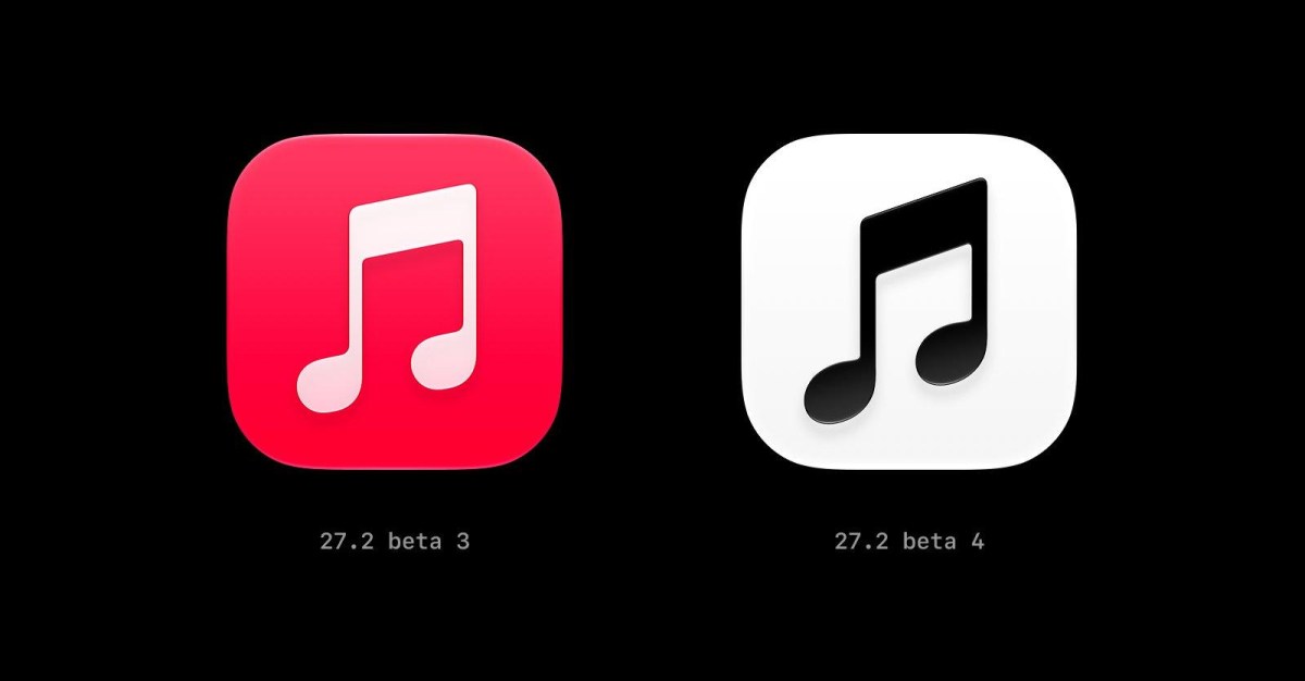
Apple Music’s iconic red app icon has reportedly been replaced with a black-and-white version in the latest iOS 27.2 beta, according to a new report from 9to5Mac. The change, which appears to be part of a broader design refresh across Apple’s music ecosystem, marks a dramatic departure from the vivid crimson branding that has been associated with Apple Music since its launch in 2015. The eighth note on the icon also appears to have a slightly sharper angle than the original, suggesting that Apple is not simply inverting colors but refining the icon’s underlying geometry as well.
The report notes that the new icon is not a uniform monochrome treatment in every setting. In light mode, the icon features a black music note set against a clean white background. In dark mode, the colors are reversed: a white music note sits on a black background. This dynamic, system-aware approach aligns with Apple’s broader design language, which increasingly emphasizes adaptability and contrast across different interface environments. The shift from red to monochrome is significant because red has long been the singular visual identity of Apple Music, distinguishing it from other Apple services such as iCloud, Apple TV, and Apple Podcasts.
According to 9to5Mac, the icon is not the only element that has been drained of color. Apple Music widgets now feature black backgrounds, a move that appears to reinforce the new minimalist aesthetic. The app has also introduced a splash of blue in the tab bar to indicate the active tab, adding a subtle but noticeable accent color to an otherwise more restrained palette. This combination of monochrome iconography and selective blue highlighting suggests Apple is experimenting with a more neutral foundation that allows functional accents to stand out more clearly.
The news comes on the heels of another design-related discovery. Last month, a new Apple Music logo was spotted on the Apple Music Hall website. Apple Music Hall is the company’s live music venue in London, located in the historic Battersea Power Station. The appearance of a new logo on that site fueled speculation that Apple was considering a broader rebranding of its music service. Now, with the apparent icon change in the iOS 27.2 beta, it seems increasingly likely that the company is refreshing its app icon to match the new visual direction introduced through the venue’s branding.
A user on X, formerly known as Twitter, shared images of the new icon in its various color modes, including the tinted version. These images give users a clearer sense of how the new monochrome design behaves across Apple’s customization options. In particular, the tinted homescreen feature allows users to apply a color tint to their app icons, which could be used to approximate the look of the previous red version. This is a notable point for long-time Apple Music users who may be attached to the service’s signature color. While the default icon may no longer be red, the tinted option provides a degree of flexibility that was not available in earlier versions of iOS.
The potential shift from a red to a black-and-white icon raises interesting questions about Apple’s design philosophy. For years, Apple Music’s red icon has been one of the most recognizable app icons on the iPhone. It stood out on the home screen, creating a strong visual anchor among a sea of colorful apps. A monochrome icon, by contrast, blends more easily with the overall interface, especially in iOS 27, which has continued Apple’s trend toward translucent materials, layered depth, and reduced visual clutter. In that context, a black-and-white Apple Music icon might feel more native to the operating system than the older, more saturated red version.
The sharper angle of the eighth note is a subtle but telling detail. Apple has a long history of making incremental adjustments to its icons and logos, often refining curves, weights, and proportions in ways that are barely perceptible to the casual observer but meaningful to designers. A slightly sharper angle could give the note a more modern, precise feel, aligning it with the geometric cleanliness of Apple’s current design language. It may also improve legibility at smaller sizes, such as when the icon appears on the home screen, in Spotlight search, or in the App Store.
There is also the question of branding consistency. Apple Music has expanded far beyond the iPhone app. It exists on iPad, Mac, Apple Watch, Apple TV, Android, and the web. It powers CarPlay, HomePod, and a growing list of smart speakers and televisions. A new icon would need to work across all of these platforms, and a monochrome design is often easier to adapt to different backgrounds, materials, and lighting conditions. It also pairs more gracefully with the Apple Music Hall venue branding, which may be part of a broader effort to unify the service’s identity across physical and digital spaces.
The introduction of black backgrounds for widgets is another sign that Apple is embracing a more dramatic, high-contrast look. Widgets have become an increasingly important part of the iOS experience since their reintroduction in iOS 14, and their design has evolved significantly since then. Black backgrounds can help media-focused widgets feel more immersive, especially when displaying album artwork or playlist covers. They also create a stronger sense of continuity with the Music app’s now-black-and-white icon, suggesting that Apple is thinking about the entire visual system as a cohesive whole rather than treating individual elements in isolation.
The blue accent in the tab bar is particularly interesting because blue is not traditionally associated with Apple Music. The service has used red, white, and black in its branding, but blue has rarely appeared as a primary accent. The introduction of blue for the active tab could be a functional choice: because the rest of the iconography is monochrome, a single color accent can provide an efficient wayfinding cue without overwhelming the interface. It could also be a nod to the broader Apple ecosystem, where blue is often used to indicate selected states, links, and interactive elements.
Reactions to the proposed change are likely to be mixed. Apple Music’s red icon has become a cultural touchstone in the years since its debut. It has appeared in advertisements, on merchandise, and in countless screenshots and tutorials. Changing it to black and white may feel like an unnecessary loss of personality to some users, while others may welcome a more understated, modern look that fits more naturally with the rest of iOS. The ability to tint the icon may help ease the transition, allowing users to restore a sense of color if they wish.
It is also worth noting that this is still a beta release. Apple frequently tests design changes in beta versions of iOS and does not always ship them to the public. The company may refine the icon further, adjust the colors, or decide to abandon the change entirely based on feedback and internal testing. However, the fact that a similar logo appeared on the Apple Music Hall website suggests that this is more than a random experiment. It may be part of a coordinated effort to refresh the Apple Music brand in time for a future software release or hardware announcement.
If the new icon does make it to a public release, it will mark one of the most visible changes to Apple Music’s identity in years. The service has undergone numerous functional updates, including the introduction of lossless audio, spatial audio, karaoke mode, and a redesigned interface in iOS 17. But the app icon has remained remarkably consistent. Changing it now would signal that Apple is entering a new chapter for Apple Music, one that may be defined by a more refined, adaptable, and visually integrated design philosophy.
The timing of the change is also notable. Apple Music Hall, the company’s new venue in London, represents a significant investment in the cultural presence of Apple Music. By aligning the app icon with the venue’s branding, Apple may be attempting to strengthen the connection between the digital service and its physical, live-music experiences. This could be part of a broader strategy to position Apple Music not just as a streaming service, but as a comprehensive music brand that encompasses discovery, performance, and community.
Ultimately, the reported icon change is a small but meaningful signal of where Apple is headed. The company has always placed a premium on design, and its willingness to rethink even the most established elements of its software is a testament to that commitment. Whether users love or hate the new black-and-white icon, the fact that Apple is still experimenting with such details suggests that the company remains focused on creating a cohesive, thoughtful, and modern user experience. The iOS 27.2 beta will continue to evolve, and it will be interesting to see whether the monochrome icon survives the journey to a public release.
For now, Apple Music users on the beta can get an early look at the proposed change. Those who prefer the classic red look can take comfort in the fact that tinted icons remain available. And for everyone else, the new design offers a glimpse of a possible future where Apple Music feels quieter, more elegant, and more seamlessly integrated into the operating system that surrounds it. Whether that future arrives in iOS 27.2 or in a later release, one thing is clear: Apple is not afraid to reimagine even its most iconic symbols.